Part 5: Building a stacked bar chart of Aave's loans in Vega
In the previous post, we built a line chart of Aave's loans in Vega. It was nice to find the 3 major coins and the minor coins, but we were unable to see the total volume of loans. We can figure that out with a stacked bar chart.
Basic stacked bar chart
Let's take a look at https://vega.github.io/vega/examples/stacked-bar-chart/. So the trick is to use a transform of type stack. You can also sort by a category so that the colors are always in the same order.
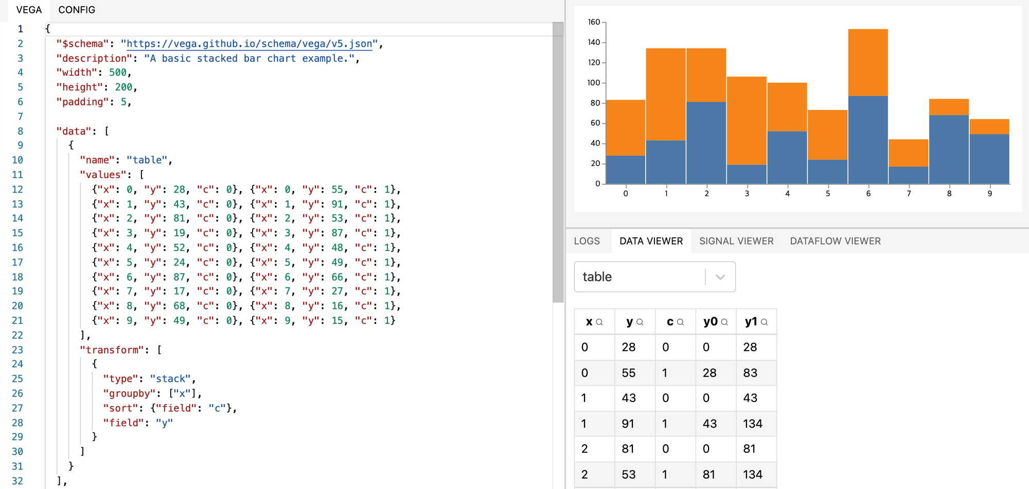
A few things differ with the previous line chart. Previously, since we wanted one line per coin, we had to group data points by coinSymbol in the marks:
"marks": [
  {
    "type": "group",
    "from": {
      "facet": {"name": "series", "data": "table", "groupby": "coinSymbol"}
    },
    "marks": [
      {
        "type": "line",
        "from": {"data": "series"},
        "encode": {
          "enter": {
            "x": {"scale": "x", "field": "date0"},
            "y": {"scale": "y", "field": "amountUsd"},
            "stroke": {"scale": "color", "field": "coinSymbol"},
            "strokeWidth": {"value": 2}
          }
        }
      }
    ]
  }
]
Now we don't have to do it anymore. We could render multiple boxes of the same currency on the same day, and ensure that they are stacked in a predictable order. You can see what I mean in this example screenshot:

Notice how the two blue bars are stacked on top of one another, making it seem like it's just one tall bar. It's not super pretty but it simplifies the code quite a bit. Let's try it on my data.
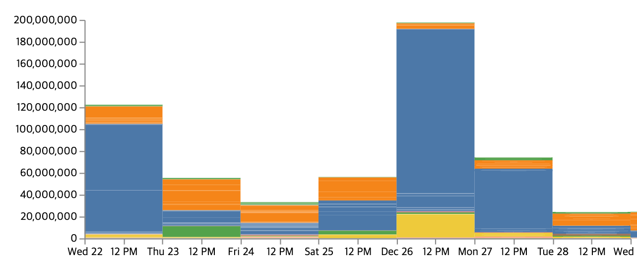
Nevermind, the resulting artifacts are an eyesore. See the code and the data:

Let's see if we can aggregate by date and coin first, then stack this aggregation.

With the aggregation first, it seems to group by coin correctly, but I've lost the date1 column.
It turns out the trick was to add date1 to groupBy:
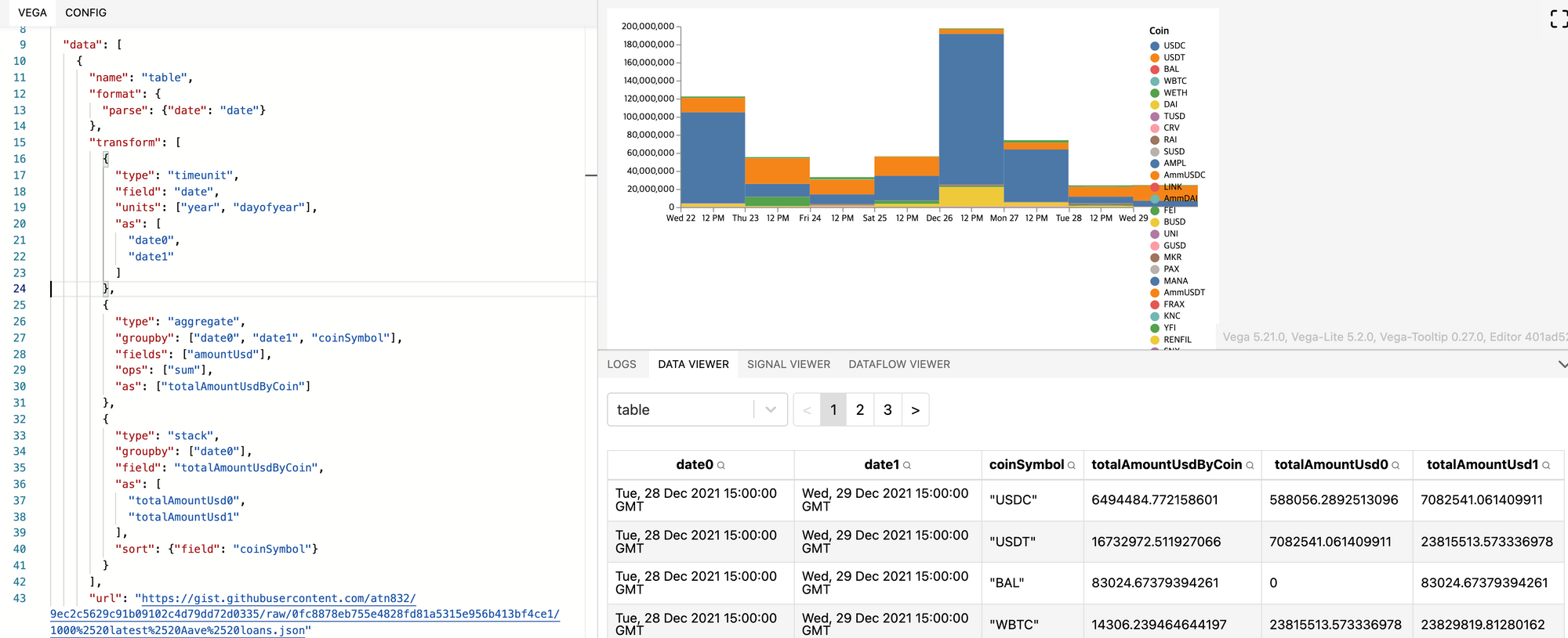
Now since the table data contains one box per currency per day, we can safely delete the coinSymbol groupBy in the marks to a simpler:
"marks": [
  {
    "type": "rect",
    "from": {"data": "table"},
    "encode": {
      "enter": {
        "x": {"scale": "x", "field": "date0"},
        "x2": {"scale": "x", "field": "date1"},
        "y": {"scale": "y", "field": "totalAmountUsd0"},
        "y2": {"scale": "y", "field": "totalAmountUsd1"},
        "fill": {"scale": "color", "field": "coinSymbol"}
      }
    }
  }
]
Next let's fix the X axis. You can see that it overflows on the right side. That's because right now, the domain computes the min and max values of date0. If we tell it to use the min and max values of date1 instead, it'll overflow on the left side. We want to compute the min and max of the union of values of date0 and date1. Luckily, Vega lets you do that elegantly. For my scale's domain, I can go from using a single field:
"domain": {
  "name": "x",
  "type": "time",
  "range": "width",
  "domain": {"data": "table", "field": "date0"}
}
To using multiple fields. See the scale domains on multiple fields doc :
"domain": {
  "fields": [
    {"data": "table", "field": "date0"},
    {"data": "table", "field": "date1"}
  ]
}
Here's the fixed time axis:

Log scale
Next I'd like to revert back to log scale. However, the stacked transform starts at zero. It's a bit artificial, but let's see if I can make it start at 1. Perhaps I could transform the stacked columns with transform that adds 1. Or I could force the y domain to start at 1. The latter seems cleaner, but I don't know if it's feasible. Later when the rectangle gets rendered with y=0, the engine might complain it got an infinity position.
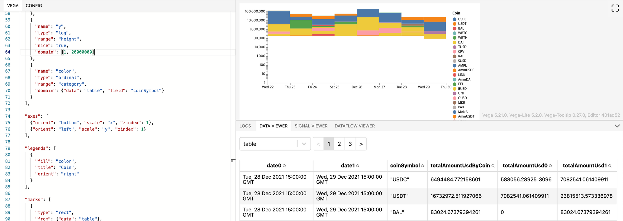
As I feared, the rectangle that starts at 0 does not get rendered.
Let's transform the data by adding 1 to the columns totalAmountUsd0 and totalAmountUsd1:
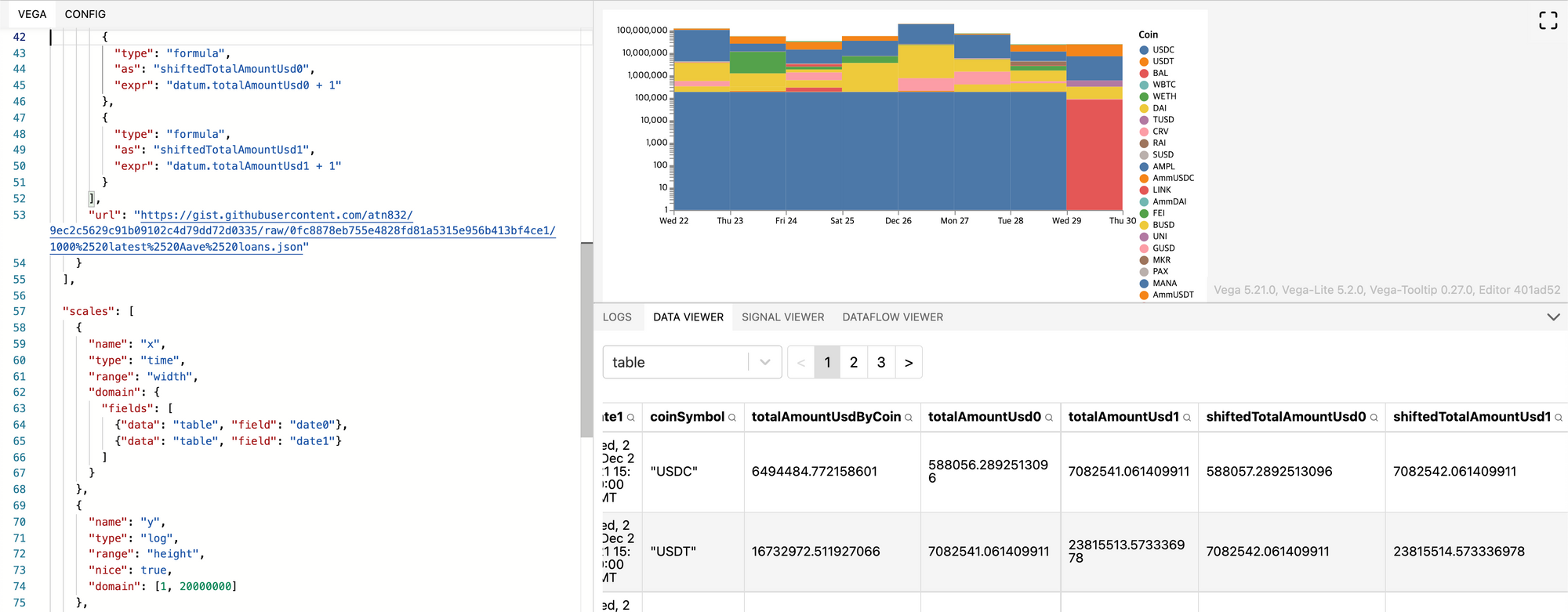
Now the graph has no missing bar. We can improve it still. As you can see, the log scale shows details at the bottom of the chart. So we should render small loans at the bottom so that they are visible.
Sorting coins
We want to sort the coins by their total sum over the whole period. To do this, let's create a new datasource. We'll call it totalLoansByCoin, with the coinSymbol and amountUsd fields. The datasource definition is straightforward:
{
  "name": "totalLoansByCoin",
  "transform": [
    {
      "type": "aggregate",
      "groupby": ["coinSymbol"],
      "fields": ["amountUsd"],
      "ops": ["sum"],
      "as": ["totalAmountUsd"]
    }
  ],
  "url": "https://gist.githubusercontent.com/atn832/9ec2c5629c91b09102c4d79dd72d0335/raw/0fc8878eb755e4828fd81a5315e956b413bf4ce1/1000%2520latest%2520Aave%2520loans.json"
}
And it produces a clean table.
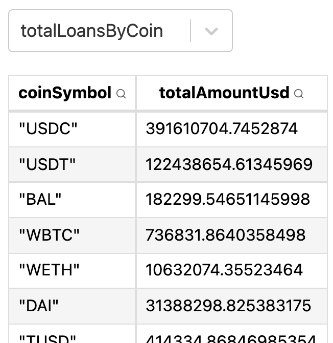
Let's use this datasource to sort by coinSymbol in the table datasource. Looking at the stack doc and how to sort, it appears that we cannot sort with another source. We can only specify a field. Then maybe I could add a column to table that sources data from totalLoansByCoin thanks to the lookup transform. The column could be called coinSize.

Perfect, now we can sort the bars by coinSize. Here's the bar chart before sorting:

And here it is after sorting:

It's not any better actually. The smallest loans take so much space that the large ones are impossible to read. I can't even check that my sorting works correctly. It also gives credit to this blog post which shows how stacked bar charts on a logarithmic scale can be misleading.
Back to linear scale
Let's revert to a linear scale and sorted arbitrarily by coinSymbol:

We'd like to move the smaller bars to the bottom so that bars are more readable and the legend also shows coins by decreasing size. But somehow, adding the "sort": {"field": "coinSize", "order": "ascending"} didn't change anything. After a while, I realized it's because the order in which I write the transforms matter. I had to put the coinSize lookup before writing the stack transform.

Now the bars are in the right place. In the legend, it's still not sorted, though. I know because KNC is worth only $9. It's the smallest value and should appear at the very bottom of the legend. The right way to do it is by adjusting the scale's domain (see doc) and adding a sort value.
{
  "name": "color",
  "type": "ordinal",
  "range": "category",
  "domain": {
    "data": "totalLoansByCoin",
    "field": "coinSymbol",
    "sort": {
      "field": "totalAmountUsd"
    }
  }
}

But as you can see, it did not change anything. Reading the doc again, I found out I should also specify an "op", since the data reference field (coinSymbol) and the sort field coinSize do not match. Here's the correct scale:
{
  "name": "color",
  "type": "ordinal",
  "range": "category",
  "domain": {
    "data": "table",
    "field": "coinSymbol",
    "sort": {
      "order": "descending",
      "field": "coinSize",
      "op": "sum"
    }
  }
}
And the resulting chart:

Still not quite readable. I guess what one could do is pick a threshold under which not to render the coin, since it's irrelevant.
See the code.
Filtering out insignificant coins
One way we could do this is with signals:
- Let the user input the $ threshold under which a coin is considered insignificant.
- Make the legend clickable so that the user can toggle coins.
- Let the user select the top K coins to show.
Out of all 3, the last one seems like the most user-friendly one. Whatsmore, there's an example readily available: top-k-plot and the fancier top-k-plot-with-others.
To be continued...